
3 ways data visualisation can revolutionise your workspace
Data visualisation is everywhere these days. Stunning infographics, gorgeous scatter graphs, insightful pie charts and beautifully designed tables bring to life the vast swathes of data that our society produces every day, hour and second. A modern take on the idea of visual communication, data visualisation is about making complex data more accessible and useful, helping us understand and analyse data quickly to gain deeper insights into the relationship between things.
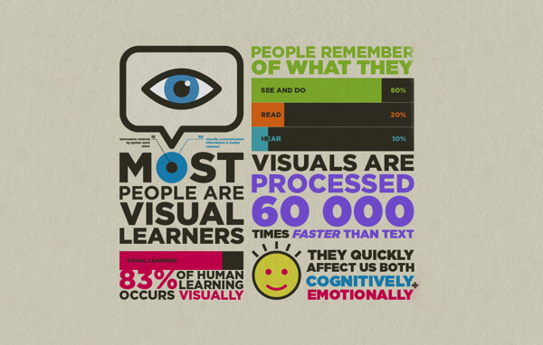
Humans are visual beings. We retain about 70% more information when it’s presented to us in a visual format. One of our missions at simple.space is to connect and enable humans in workplaces to be more in-tune with the space surrounding them.
How does this relate to managing your workspace?
To quote Dr. Thoralf Sundt of Mayo Clinic, “If I can see it, I can fix it.” The reverse must also be true – it’s hard to fix what you can’t see (Lean.org have said this so succinctly elsewhere that we can’t take credit for this insight). To support and sustain growth in your workplace, you need to be able to identify the problems in the way you carry out your work in a the physical sense – the desks, chairs and computers that allow your human capital investment to carry on (or cramp) your business. And to get back to Dr. Sundt, the most effective way to do this is using data visualisation techniques.
Here are three things you didn’t know about data visualisation and how it can benefit the way you manage your work space
1. It can empower your employees
Traditional data modeling is the empire of the geek, the bailiwick of the excel wizz. This means many of us – the average HR or office managers who don’t get their kicks from crunching out a VLookup – can’t get the insight we need to make evidence based decisions on staffing and space management issues.
2. It helps you see what’s around the corner
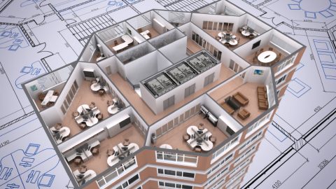
Office relocations and new seating arrangements require multiple scenarios to be planned, ongoing collaboration and layers of approvals to deliver great outcomes – and comparisons between the old and new are a must in defining the new world order.
But It’s hard to evaluate the current and future state with a set of paper floorplans and some highlighters. Just like a map is for driving directions to your destination, visualising your work spaces helps you understand how to reach your desired outcome much more quickly and simply.
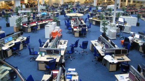
3. It creates a sense of community in a workplaces that are becoming more screen-based and less people-focused
Most of us have lived and worked in office environments with little visibility on who is who and just where they might be sitting. Staff directories are usually dated, you’re unsure who to contact, or perhaps there’s more than one “Steve” in the legal department. Once you’ve worked out it’s Steve-from-Sydney, not Steve the dragon boat racing enthusiast, directions to find where Steve sits are scarce and it’s hard to know which desk belongs to whom or why no one is sitting in that corner. Data visualisation gives you a new way to put a face to a name, a desk to a person and useful directions to find them both.
To get more tips and advice on managing your workspace, subscribe to our newsletter


